Looking for Resources?
Get a subscription for envato elements for unlimited downloads of 9,500,000 items for only $16.50/month on yearly billing!

By CreativB Studios – 27 May 2022
Luxury brands aren’t just about the design and how it looks its about how the brand makes you feel.
A product like a smartphone is just a smartphone that helps people communicate but when you look at Apple, clearly they classify as a luxury brand so what makes them different from their competitors?
Their design, marketing, simplicity, and brand message have been consistent throughout the years which shows that they’re trust worthy.
Now that we know how a luxury brand is formed, lets focus on the design aspect of it and what things you should avoid while designing for a luxury brand.

When designing for a luxury brand it’s important to not go overboard with your design and focus on the brand message and what their future goals are in the industry.
Consistency matters in a brand whether it’s the design, product, values, or even customer experience. If the consistency of a brand is shaky then the perception of the brand will also be shaky.
Below are a few things that you should avoid when designing for a luxury brand:
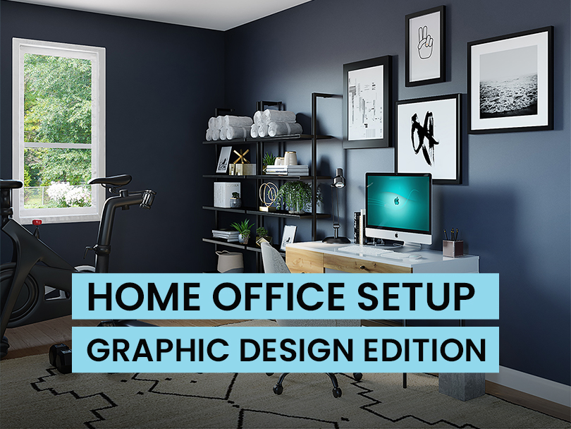
A clustered design can harm your brand tremendously.
Imagine buying a studio apartment and stuffing it with 3 beds, 4 refrigerators, 3 TVs, and 5 office desks. Crowded right?

Whether its your logo, poster design, or even a website. It could affect your users experience and make them turn away from whatever it is that your brand is trying to market.
As a clustered design doesn’t guide the user’s eye through the design, so they may not even get to the important part.

This applies to every aspect of design, and it especially applies to luxury brands.
When we talk about luxury, we imagine big, minimal, and expensive. Our minds have been programmed to believe that the standards have been set.
Changing that perspective takes time, expertise, and a lot of work.
But, one thing is for sure. Clustering up your designs will not help your brand in achieving that luxury status.
Using bright colors for a luxury brand is another no-no…
Strong, bright colors and neon colors can have a powerful effect on emotions. Colors like bright red, bright yellow, and neon green can feel energizing and make you feel more alert, but can also be irritating to the eyes.
Luxury should be pleasing and attractive to the eye. The more attractive the brand seems, the more a user would stick around and hopefully make a purchase.


If you want your brand to look luxurious then staying away from generic stock images should be on your list.
Generic Stock images don’t usually convey a sense of class, so using them in your design may conflict with your message.
When it comes to pictures try investing in a professional photoshoot, this way you will have full control over every aspect of the process.
And a professional photoshoot also shows that this brand is actually serious in what they do which adds a level of trust in the viewers eyes.


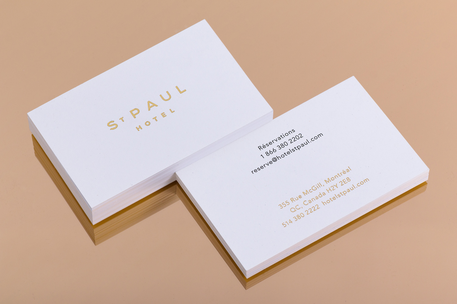
Typography is a major part of what makes a design luxurious.
The font style, weight, tracking, x-height are some of the factors that give fonts a personality. What do we mean by giving fonts a personality?
For eg, using an italic bold display font would not work for a luxury brand but would definitely work for a formula 1 logo as it provides a sense of motion due to its weight and slant.

Choosing the wrong font won’t ruin your brand but it won’t reach the level you want it to because it might not convey the message.
Think about it, how do consumers make decisions? There are quite a few factors but one of them is based on research in which the consumer will analyze your brand either through your website or a location.
If the brand does not look professional or visually pleasing, the consumer might make the decision that this brand is cheap and may go somewhere else. Thus hurting your business.
Now this part is based on personal opinion.
Adding drop shadows to your designs takes away the elegance of a brand because not everyone knows how to use them properly.

Drop shadows are typically used for the purpose of legibility when you want a certain element or text to separate from your background. This occurs when the element and the background are of similar color.
But, for a design to qualify as luxurious you have to make sure that there is high contrast between elements. So adding drop shadow to an already high contrast design makes no sense and makes the entire design look ugly instead of luxurious.
Now don’t get me wrong, drop shadows can be very useful and attractive when used correctly and in the right scenario.
Making a brand feel luxurious is much easier than you might think, the first step in making a brand luxurious is try and keep it simple. Even before selecting what color or font to use.
Simplicity is key in a luxury brand design along with these major steps:
While there are no hard rules when it comes to color, sophisticated color palettes tend to have the following traits in common:


%22%20transform%3D%22translate(1.9%201.9)%20scale(3.78906)%22%20fill-opacity%3D%22.5%22%3E%3Cellipse%20fill%3D%22%23626262%22%20cx%3D%22175%22%20cy%3D%2240%22%20rx%3D%2240%22%20ry%3D%2251%22%2F%3E%3Cellipse%20fill%3D%22%23fff%22%20cx%3D%2256%22%20cy%3D%2217%22%20rx%3D%2265%22%20ry%3D%22255%22%2F%3E%3Cellipse%20fill%3D%22%23fff%22%20rx%3D%221%22%20ry%3D%221%22%20transform%3D%22matrix(-13.8487%20-66.87282%2027.82405%20-5.76208%2069.8%2013)%22%2F%3E%3Cellipse%20fill%3D%22%236d6d6d%22%20rx%3D%221%22%20ry%3D%221%22%20transform%3D%22matrix(-.27824%2018.95767%20-19.86404%20-.29154%20175.2%2033.3)%22%2F%3E%3C%2Fg%3E%3C%2Fsvg%3E)
A luxury font is exactly what it sounds like; luxury typefaces exude elegance, class, and distinction. However, not every font can be classified as a luxury font, as the font you choose for your project is crucial to its success.
If you want to build a luxury brand then you should focus on using elegant typography.
Elegant typography doesn’t mean that you can only use script font styles, Serif and sans serif font styles also have elegant characteristics.

If you look at apple, chanel, porche, and many other luxury brands you will observe one thing… White space!
White space or also known as negative space is a major factor why most luxury brands look the way they do, their designs have room to breathe and don’t distract the eye with unnecessary elements.
But the difficult part about using white space in your design is that any element you do have in your design gets emphasized, so if you are using typography that doesn’t suit the brand message then that too gets emphasized which negatively affects your brand image.
Texture may not seem luxurious but when used right can elevate your brand into that category.
Now what luxury textures should you use? Well that depends on what the concept behind the brand identity.
But, some textures that you should avoid for luxury branding are grunge textures, colorful textures. Subtle textures are what gives your brand the luxurious feel.

The layout of your design should be well thought out as sticking words in the middle of the page and leaving empty space all around won’t provide that luxury brand feels to your designs.
It really matters where your elements are and whether it follows a visual hierarchy or not.
If the layout doesn’t look right and seems unbalanced then the luxury aspect is out the window.

Shapes are another way of adding luxury to your design and it depends on how you use them because using too many shapes can make the design look unprofessional and clustered.
Use shapes that align with the brand identity along with the proportion of the shape compared to other elements in the design is important as well.


Get a subscription for envato elements for unlimited downloads of 9,500,000 items for only $16.50/month on yearly billing!